
When it comes to the colour scheme at the trade fair stand, people probably think first and foremost of their own CI. While it’s good and important to incorporate corporate colors at your booth, there is so much more potential in the targeted use of coloration. In this article, we’ll show you what effect colors have and how to use them most effectively for your trade show booth.
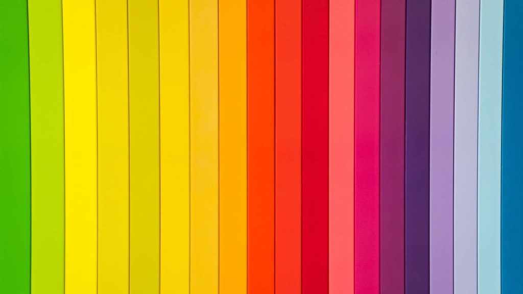
The variety of colors and their meaning
Each color has its own meaning and a very special effect, with which especially that area of our brain is addressed, which acts subconsciously and intuitively: Our emotions. Thus, when looking at a blue wall, we feel far calmer and cooler than when looking at the opposite wall with a red facade. The associations between color and feeling are far more powerful than rational data and facts because they are deeply embedded in our subconscious. This effect can be used in marketing and therefore of course also at the trade fair stand. However, before deciding on a colour, one should study the psychology of colour in detail in order not to create the wrong effects.
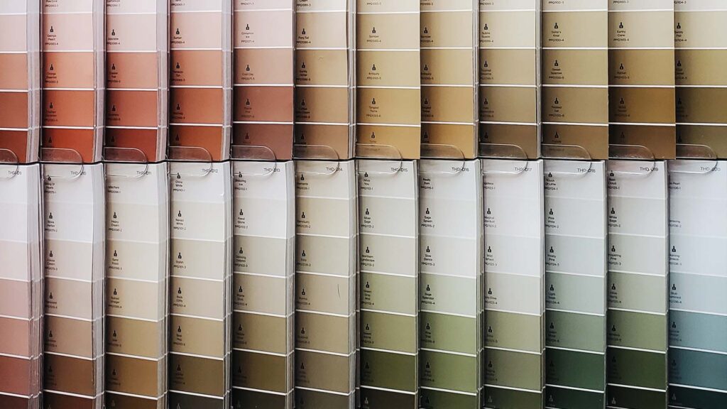
Shades and tones
Not only the colour itself plays a role in the overall effect, but also its brightness and intensity. Brighter and flashier colours attract our attention far more often than thinner ones, because in nature they stand for poisonous animals or plants. Natural shades also differ in their effect from artificial neon colors. For example, a bright neon green is less likely to suit an eco-friendly and nature-conscious brand, although it is a shade of green.
Colour combinations
In addition to tones and gradations of individual colours, their accompaniment is also decisive for the effect of the trade fair stand. So as soon as you use more than one color, you have to be aware of the reciprocal effect. Colours can reinforce and support each other positively, but they can also be in stark contrast to each other. For example, the appetite-stimulating effect of red is enhanced by combining it with yellow, which is why many fast-food chains use this combination
Complementary colors and contrasts
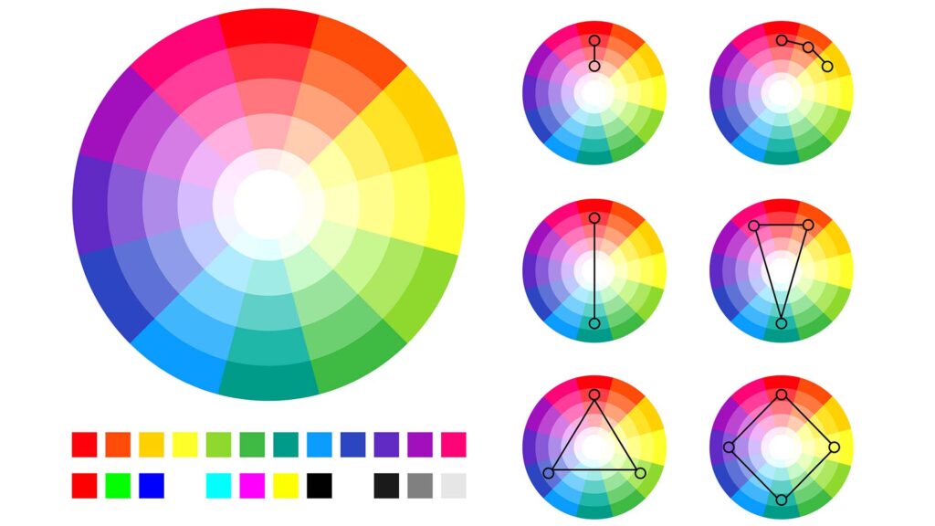
When selecting colour combinations, you should be guided by the colour wheel. The colours opposite each other in it, called complementary colours, have a very strong, powerful and lively effect when combined. They complement each other and ensure maximum luminosity and colour effect. This results in the following strong combinations: Yellow and purple; blue and orange or red and green. These complementary contrasts often seem loud, colorful and powerful. Furthermore, there is also the possibility to combine warm and cold colours and thus also have a perceived effect on the room temperature. For example, you can combine blue and yellow or orange and green. Light and dark colors, as well as intense and desaturated tones of the same color, can also be perfectly combined. In general, it is important to know what effect you want to achieve. Colour combinations of colours lying next to each other in the colour wheel or of different shades of the same colour appear harmonious and contrasts, depending on the type of combination, appear deliberately accentuated.
Colours in trade fair stand design
Exhibition stands are often small and located in the rather restless, unnatural atmosphere of a crowded exhibition hall. Each exhibitor tries to stand out as much as possible from the variety of similar suppliers and to be remembered positively by the visitors. This is precisely where colours can be used in a targeted manner. Lighter colours in the room design provide a visual enlargement and warmer tones, such as orange, also provide a perceived higher room temperature. Blue tones, on the other hand, radiate calm, but also have a cooling effect. With this background knowledge, your selection of the right color scheme for your booth should take many aspects into consideration. So here is a brief overview of the most important colors and their effect on the human mind:
Yellow
The colour yellow always has a summery and positive effect, brings a good mood and creates a pleasant, warm atmosphere. Small exhibition stands in particular are visually enlarged by bright, yellow surfaces. Another advantage of the colour yellow at the trade fair stand is its positive effect on concentration and brain power. This is why it is also suitable for meeting rooms at the exhibition centre or for discussion rooms.
Orange
Even stronger than yellow, the colour orange brings warmth and friendliness to the exhibition stand. Similar to red, the color stimulates the appetite and encourages sociability. It is therefore ideal for the catering area, the coffee corner or for cosy lounges that invite you to linger.
Red
No other colour stands for dynamics and energy as much as the colour red. Accordingly, it also has a stimulating effect on the body and psyche. The disadvantage of this is that large-scale use tends to be irritating in the long run and leads to greater restlessness. Red is therefore ideal for activating impulses, for example as isolated accents in dining areas.
Purple
With its noble and solemn aura, violet creates a sacred mood. It has a calming and inviting effect, which is why it is well suited for the reception area at the exhibition stand.
Blue
Much like a cloudless sky or a smooth lake surface, blue provides clarity and calm. In lighter shades, this colour also has a magnifying effect, making it ideal for small, narrow exhibition stands in noisy, exciting exhibition halls. The cool and relaxing effect also speaks in favour of its generous use in exhibition stand construction.
Green
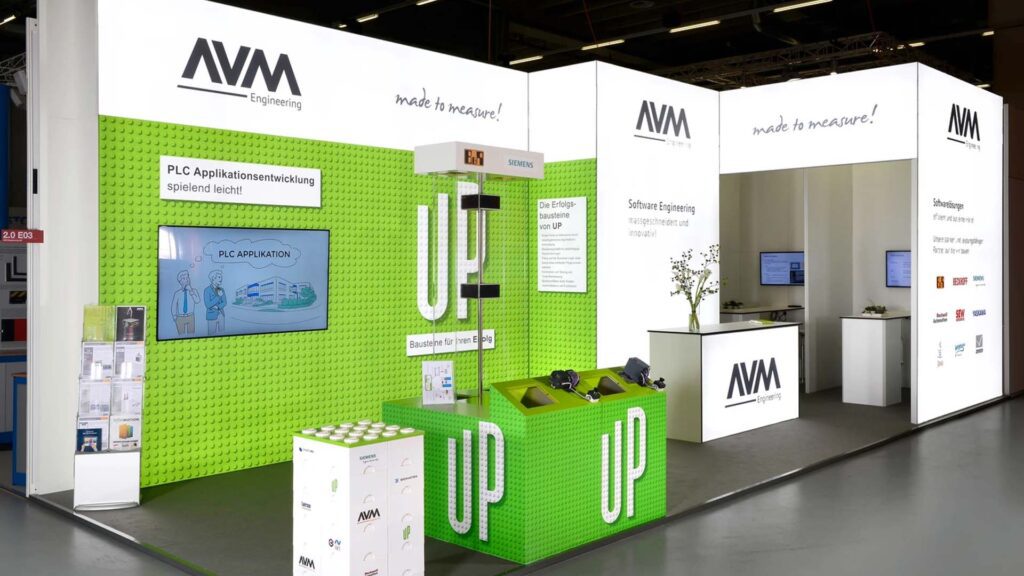
Like blue, green has a calming effect and also provides more balance, security and a sense of nature. It awakens the desire for new things and spurs on more creativity. With these associations, a green touch should therefore not be missing from any trade fair stand. Plants or vertical gardens are particularly suitable for this purpose, as they also improve the indoor climate and underline the sustainable image of a brand.
Possibilities of colour design at the exhibition stand
All these colours can be used in a variety of ways at the exhibition stand in any shade. Entire walls provide strikingly coloured eye-catchers, while individual pieces of coloured furniture, for example, provide loosening accents. Of course, light is also suitable for immersing specific areas in color. This doesn’t have to be disco-like colorful lighting either. A very cool light, for example, has a high blue content and therefore has a more calming effect, while a warm light has more orange tones in it and has a cosy and sociable effect. However, the easiest way to bring color to a booth is through print elements. These can be large graphics, or just smaller pictures on the walls. They can be backlit and shine as if by themselves, or they can be printed out to take away and bring tiny but pleasantly noticeable splashes of colour to the exhibition stand.
In the conscious and targeted selection of colour design at the trade fair stand, it is above all important to be clear about the effect of each individual colour and to take into account even the smallest emotional consequences through its use. Even tablecloths or napkins for coffee have their own little effect on booth visitors. So all the components of a trade fair stand, from giveaways to the floor we walk on, contribute to the overall effect. If this excursion into colour psychology was too short for the planning of your trade fair stand, you can contact us at any time and we will be happy to advise you in detail about the perfect and not only colour-appealing design of your next trade fair appearance.