
The use of colours on the exhibition stand can convey both emotions and company values – and offers almost infinite application options. In order to make the best impression on trade fair visitors, exhibitors should always take the most important trends to heart when choosing colours. In this article, we summarise for you the current innovations & developments in the use of colours on the exhibition stand.
Naturally colourful – the use of natural colours
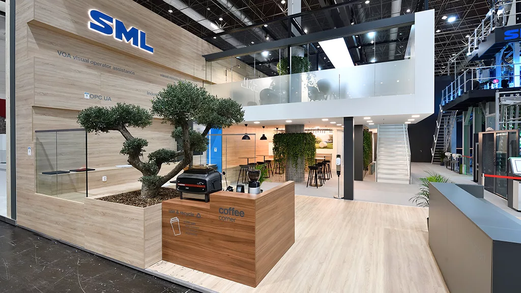
The worldwide increased sensitivity for climate-friendly and sustainable solutions is also reflected in the choice of colours in the trade fair design. Numerous earth colours and wood grains, paired with natural green are therefore trending across industries. However, the trend towards more ecological responses goes far beyond the use of colour shades. More and more companies are now using real natural materials instead of chemically manufactured laminates. The reuse of materials through recycling and upcycling, in the spirit of the circular economy , is becoming increasingly popular.
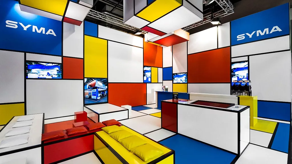
Colour Blocking
Another recurring trend is “colour blocking”. Contrasting or complementary colours are combined, i.e. placed next to each other, to create a particularly striking effect. Complementary colours are, for example, yellow and violet, red and yellow or orange and blue. The interplay of different colours in precisely arranged, sculptural shapes creates a refreshing and modern look that is reminiscent of the hustle and bustle of big cities. The famous French painters Piet Mondrians & Georges Seurat and the fashion designer Yves Saint Laurent are considered the starting point of this development.
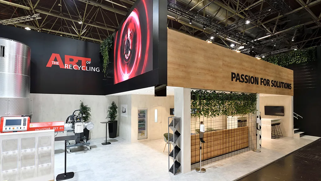
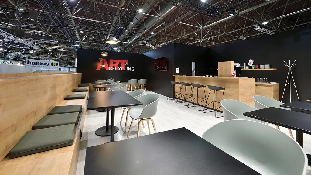
Warm stand design instead of sterile cold
After the long years of social distance, warmth and friendliness are once again more in demand, even in trade fair construction. Cosy stand designs with warm, natural colours and organic shapes look more inviting than sterile walls and exclusively clean lines. Here, the focus is on neutral colours instead of pallor, and wood and fabric are more popular than metal. Before using this psychological motif, however, it should be analysed whether the associated aura fits one’s own corporate identity or industry.
Colour gradient in trend
Colour gradient (also “colour transitions” or “gradient design”) is the mixing of colours – with the aim of enabling smooth transitions from one colour to another. This mixing technique allows for a number of different effects. It can, for example, create visual depth or freshen up an otherwise rather monotonous subject. Colour transitions can also create an energetic or romantic mood, depending on the choice of tones.
Using ambient light optimally
The lighting conditions surrounding the stand offer great potential and should always be taken into account. It makes a noticeable difference whether a coloured surface is illuminated by an LED, fluorescent or incandescent lamp or by the sun. Each option makes the colour “appear in a different light”. A preliminary check of how the chosen stand colours interact with the respective trade fair lighting , should not be missing in any conscientious trade fair preparation.
Always keep an eye on the balance
Colour, as has already been underlined, has a significant influence on stand design. The choice of colours for walls, posters and the stand itself must always be seen in conjunction with all other elements. Therefore, answers to the following questions are important in advance: What materials will be used on the stand? Which floor covering? What clothes do the stand personnel wear? What is the lighting concept for the exhibition hall? What other stands and designs surround your own stand?
It is well known how profoundly colours can influence our perception of space. Our exhibition stand designers therefore work intensively on choosing the right colours for our customers’ exhibition stands. In doing so, the SYMA experts pursue a holistic approach that incorporates current colour trends, theme-specific colour aspects, lighting and floor design, the situation-specific marketing strategy and the respective, customer-specific brand colours (CI). If you are interested in making your next trade fair stand an eye-catcher for your visitors with an appealing play of colours:inside, contact us. We look forward to your enquiry.